Corporate Media
The pieces in this section demonstrate some of my versatility in responding to a variety of layout and design requests for businesses and small organizations.
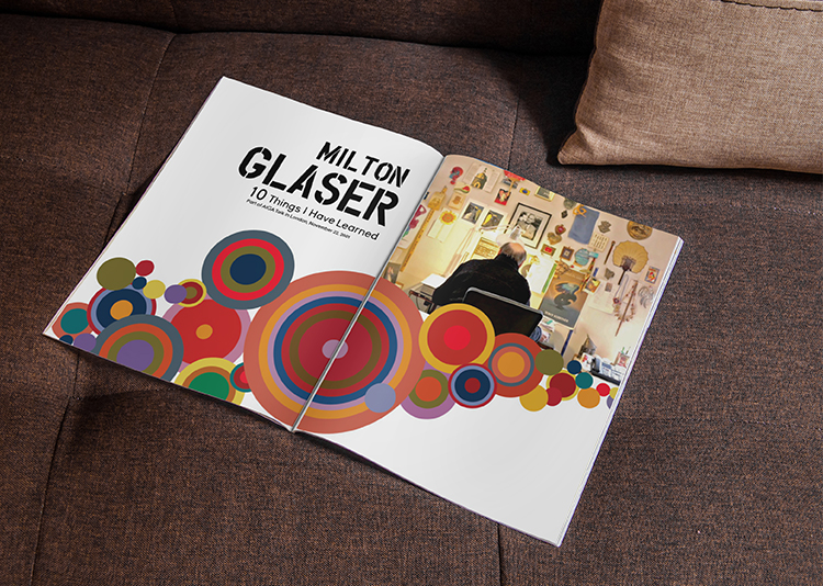
Milton Glaser, 10 Things I Have Learned
Typography, Print Design
InDesign (layout), Illustrator (artwork)
Project Overview
For this project, I was tasked to take Milton Glaser’s essay, “10 Things I Have Learned,” and create it into a magazine spread. I conducted research into Glasers artistic life and studied some of his prominent works.
The geometric circles I created are inspired by the poster design Glaser did for the Saratoga Festival, 1980. In this poster, the Greek God, Pan, sits on a hillside with images of circles drawing towards his ears. He states that the circles “...arrive at the ear of the meditative figure to suggest the act of listening,” which seemed appropriate for demonstrating the knowledge he now imparts in the “10 Things” essay. Along with the artist research, I chose photos and quotes that I felt further emulated the essay’s message.
I utilized font families that were readable, intriguing and classic; Young for headings, Overspray for quotes, and Adobe Garamond Pro for the body. Paying special attention to kearning, leading, and wrapping margins around images was paramount in executing this design to be both legible and aesthetically pleasing to the eye.
Table Top Displays
Print Design
InDesign
Project Overview
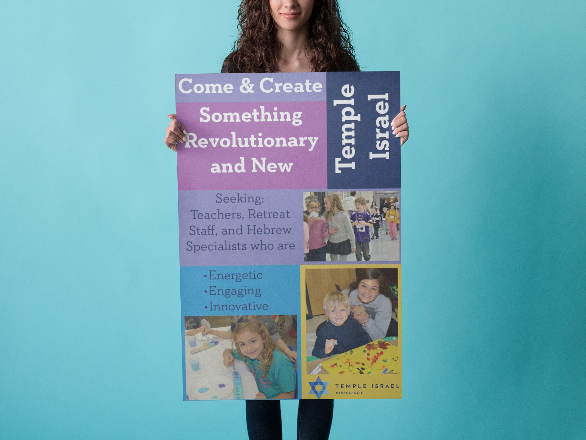
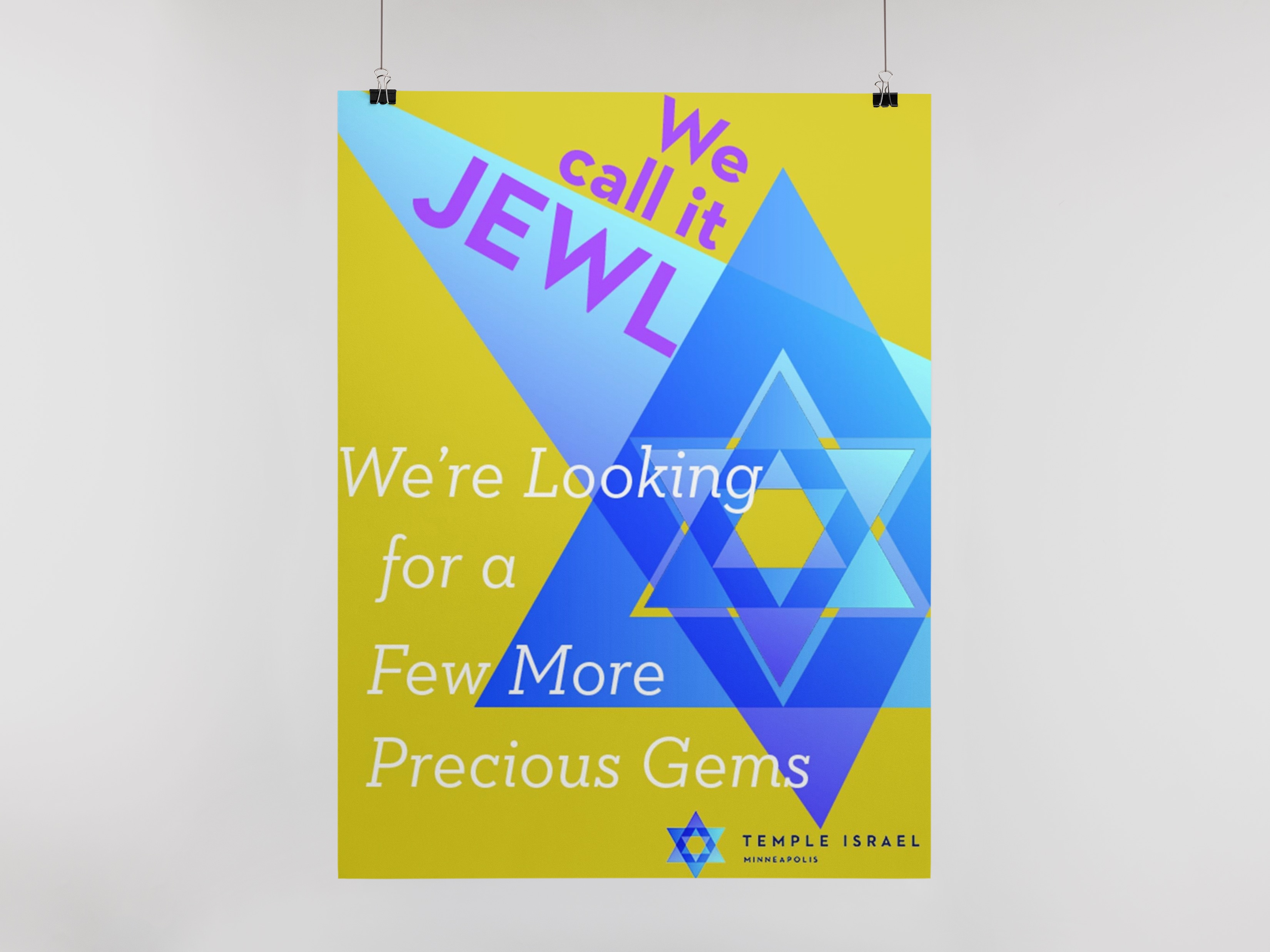
While on a contract assignment for Temple Israel, I was asked to assist the marketing department to create materials for Human Resources. These signs were used as table top displays at a job fair.
Because these pieces were being used to attract people to teach in the Early Childhood Center, I focused on using vibrant colors, engaging photos, catchy phrases, and a fun incorportion of their Star of David logo.
Honey Label, Jamaica
Print Design
Illustrator
Project Overview
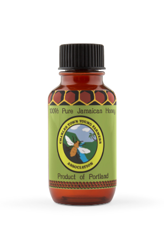
Honey is in high demand in Jamaica. Depending upon which part of the island, the bees produce a distinct bouquet and unique flavor. Far on the Island’s East side, in Portland Parish, is a beefarmer friend who has honed his skills in beekeeping and honey extraction.
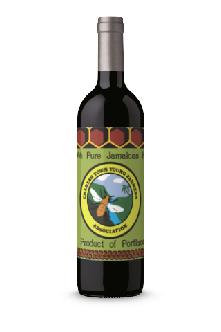
Often, Jamaican honey is sold in a recycled rum bottle, but Bobo Richie wanted to step up his game and asked me to design a label to help set him apart from the local competition and open up the possibility of greater island-wide and international sales.
My design is a repetitive pattern based on the honeycomb, an essential part of the hive for the storage of honey. I chose the color green, which relates to nature and energy; and brown, a warm color that stimulates the appetite.
Tri-Fold Brochure
Print Design
InDesign
Project Overview
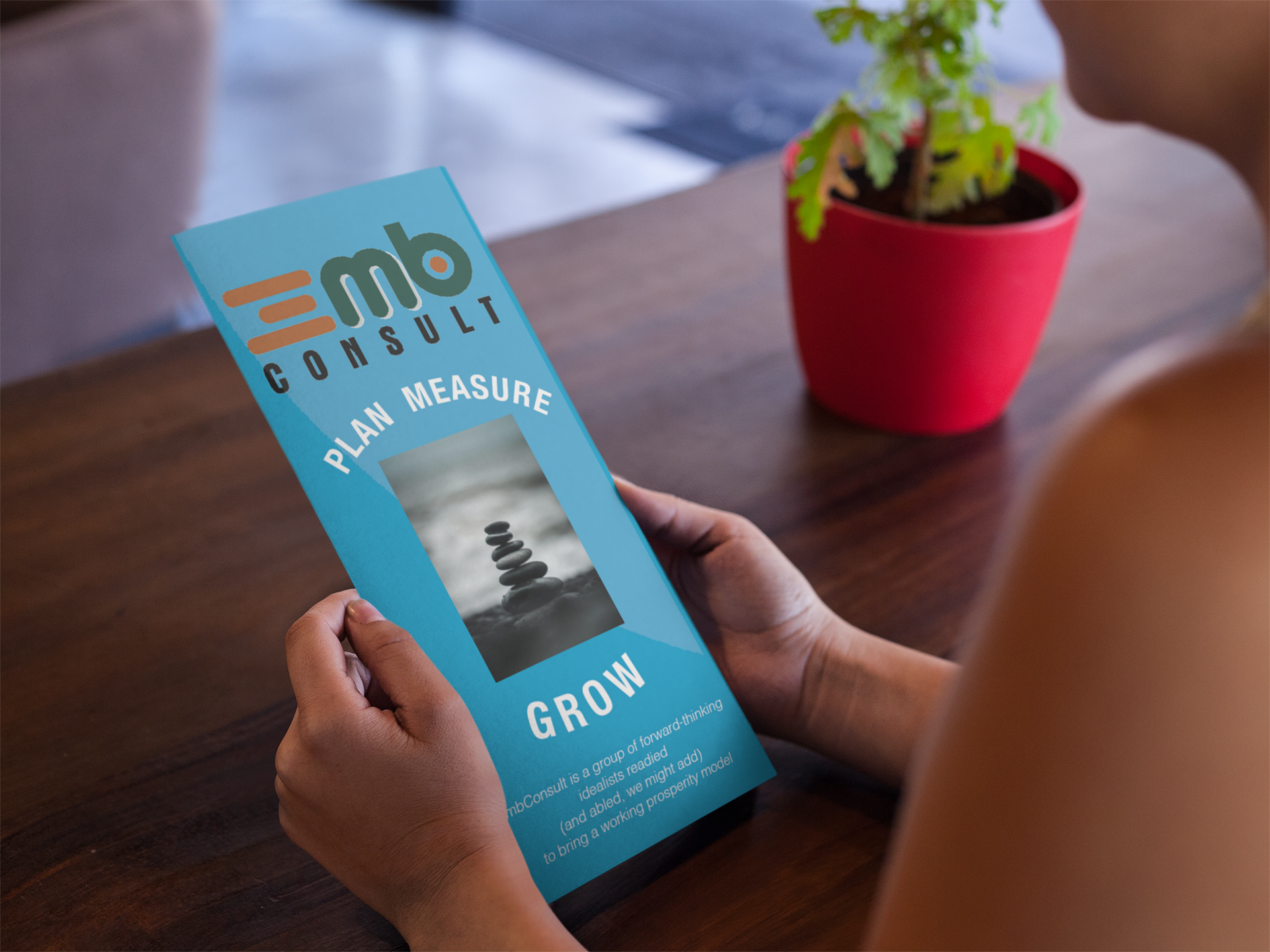
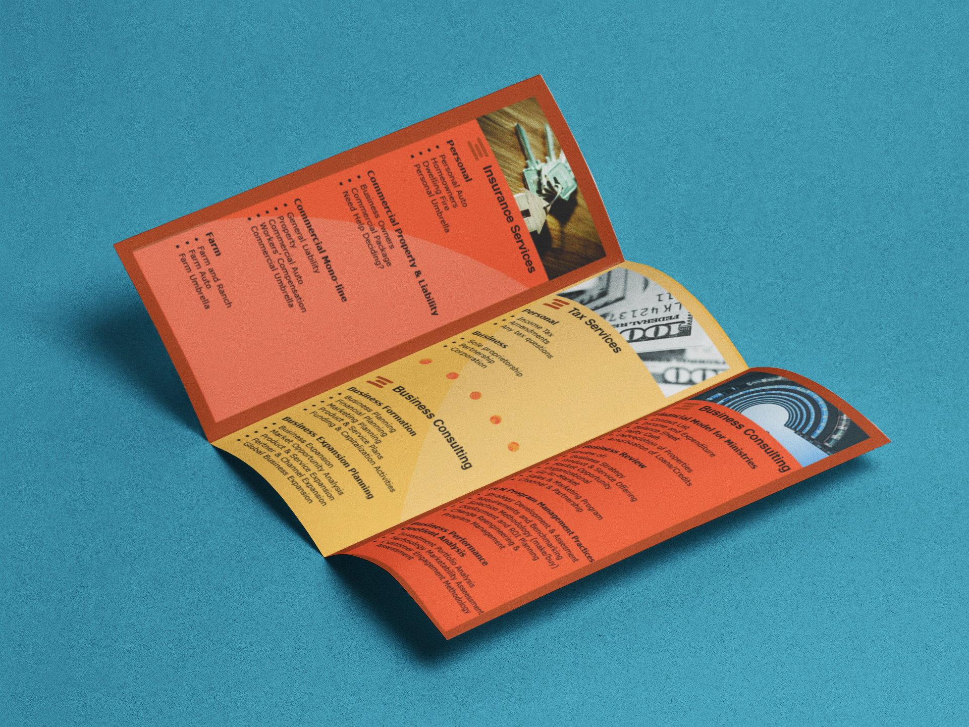
A business client asked me to design a tri-fold brochure that was simple, yet eye-catching. Something that would offer basic information while at the same time, grab the attention of potential clients.
In an effort to build customer loyalty, I designed the external pages of this piece with shades of blue, a universally favored color relating to trust, honesty and dependability. When the recipeint opens the cover, they are greeted by the analogous colors of invigorating yellow and punchy orange which creates a perfectly balanced and stylish look overall.
